
Building in React and Tailwind CSS is a dream
As a web developer, there's always a new shiny object you could be learning. It's exciting but overwhelming at the same time.
One of the tools I had been told I need to try in the last few years is Tailwind CSS. For the last two years, I've tried to avoid using it because I want to master CSS before moving onto another tool.
Plus, with things like CSS modules now, plain old CSS has come along way and is easier then ever to use in a modern component based framework like React.
But I've been hearing more and more about Tailwind CSS and how it's a game changer for CSS. So I decided to give it a try.
Recently, I have been using Tailwind CSS and I have found it to be a superior choice compared to frameworks like MUI and Chakra. To be clear, they are different things. Chakra or MUI are component libraries, and Tailwind is a utility framework.
One of the key reasons why I prefer Tailwind over these other frameworks is its utility-based approach. Instead of providing a set of pre-defined styles, Tailwind offers a wide range of utility classes that allow me to quickly and easily style my elements. This means that I have a lot of flexibility in how I design my interfaces, and I can create custom styles without a lot of effort. In contrast, frameworks like MUI and Chakra are more opinionated and have a more limited set of pre-defined styles, which can make it difficult to achieve the specific design that I want.
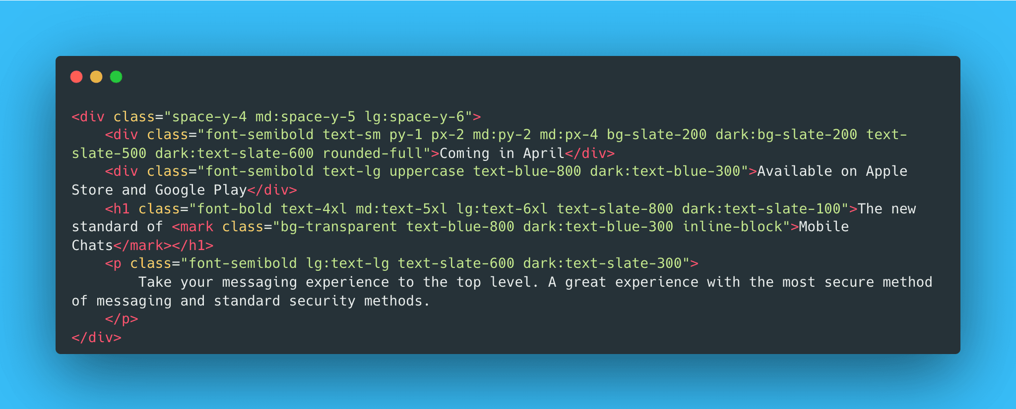
Another reason why I like Tailwind is that it is easy to use with React and fits in perfectly with how React works. Everything before the Return statement in a React component is JavaScript, and everything after the Return statement is HTML, JSX, and CSS. This means that I can keep my CSS in the same place as my HTML which is super nice and easy to maintain.
I can easily import the Tailwind styles into my React components and use the utility classes to style my elements. For example, I can create a button component like this:
import React from 'react'
import './tailwind.css'

function Button({ children }) {
  return (
    <button className="rounded bg-blue-500 py-2 px-4 font-bold text-white hover:bg-blue-700">
      {children}
    </button>
  )
}
In this example, I am using the bg-blue-500 and hover:bg-blue-700 utility classes to style the button. This allows me to create a professional-looking button with just a few lines of code. I can also easily customize the styles by changing the utility classes that I use.
Overall, I have found Tailwind to be a powerful and flexible CSS framework that is well-suited for use with React. Its utility-based approach allows me to quickly and easily create custom styles, and its compatibility with React makes it easy to integrate into my projects. If you are looking for a CSS framework that is easy to use and highly customizable, I would definitely recommend giving Tailwind a try.